Scott Sonia
Product Designer. Creative Director. Team Builder. Over two decades designing exceptional digital experiences for people.
“
Scott leads from the front. He's always willing to put in the work it takes to lead and he clearly articulates his vision while still being willing to adjust when the situation warrants it.
Anonymous Peer Review

WORK
Cigna Site Refresh & Design System
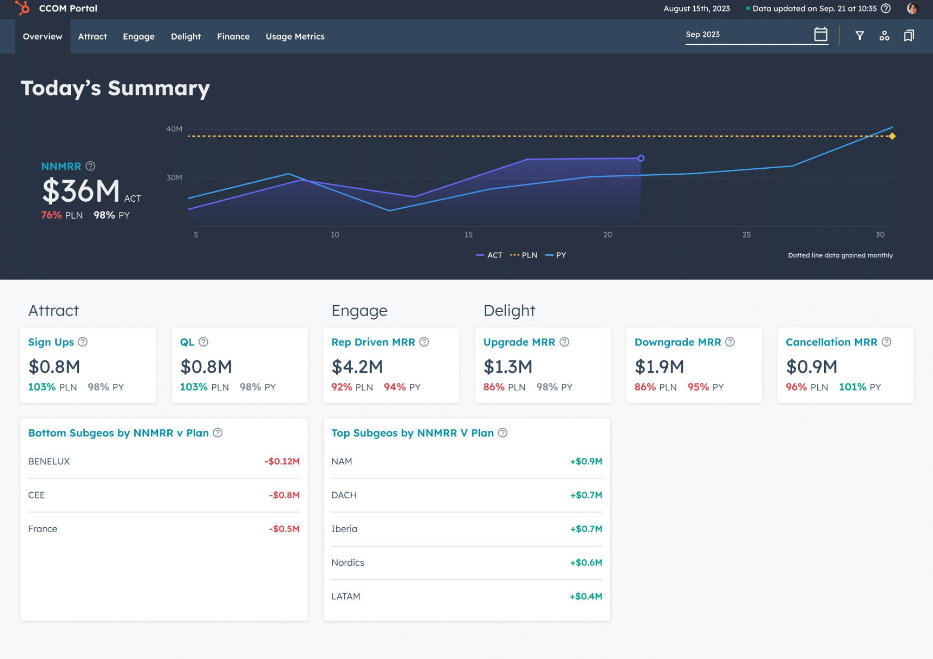
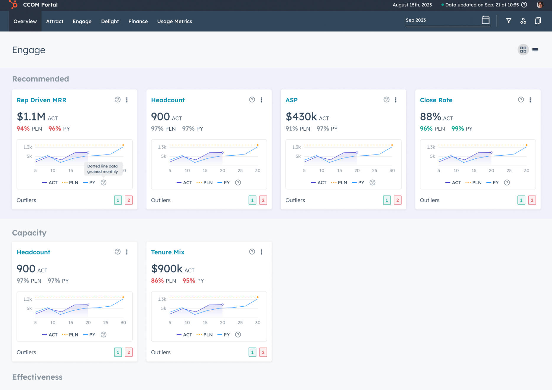
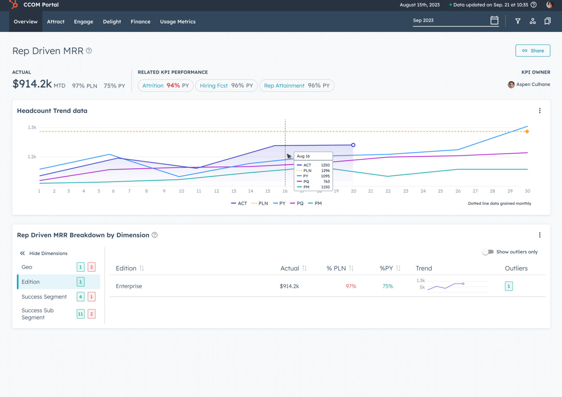
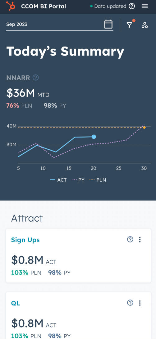
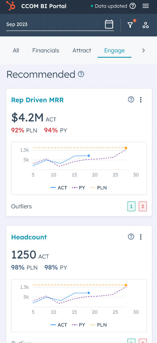
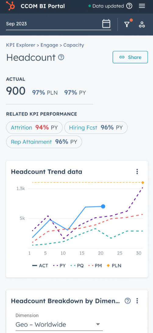
Hubspot BI Data Portal
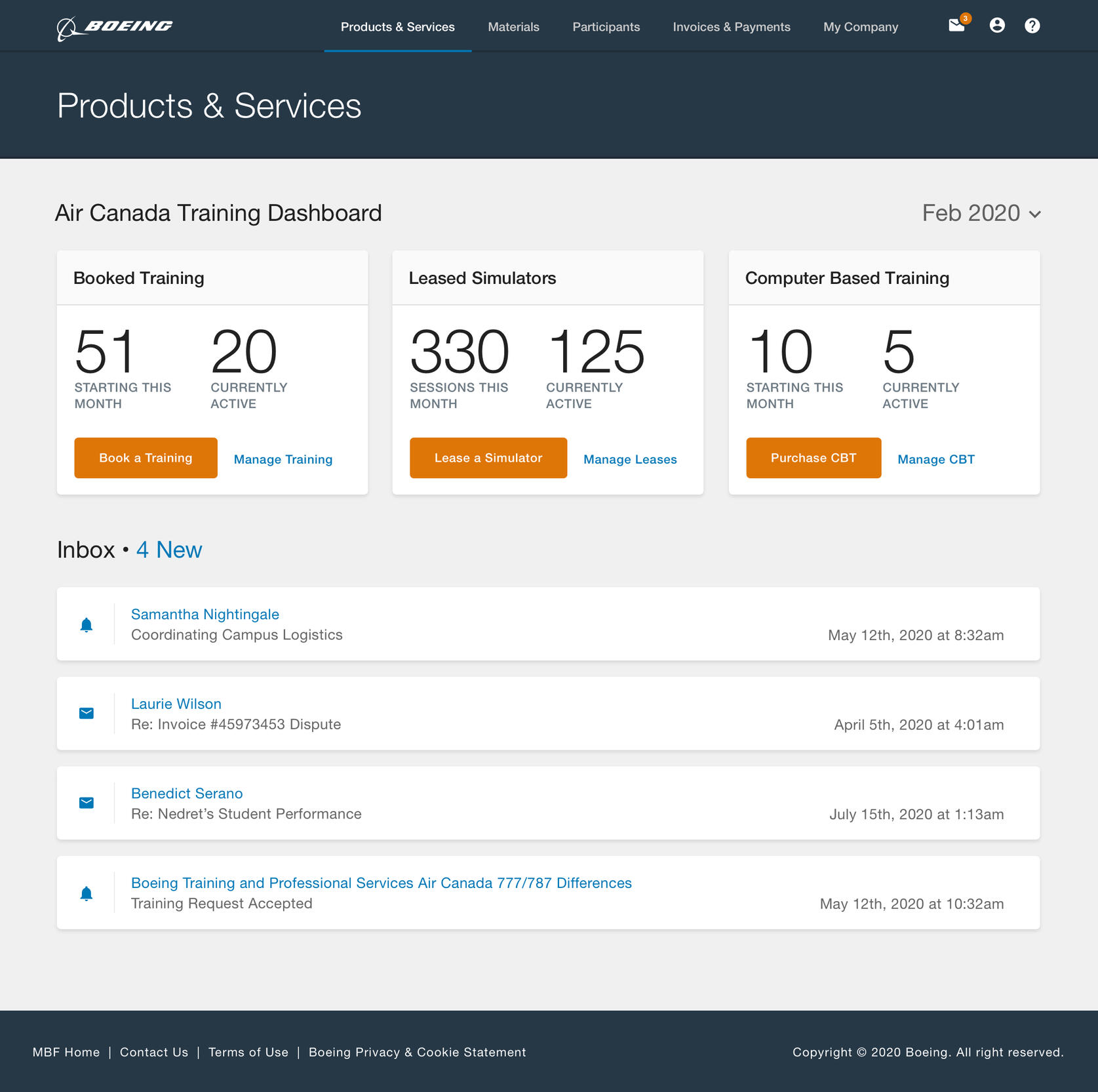
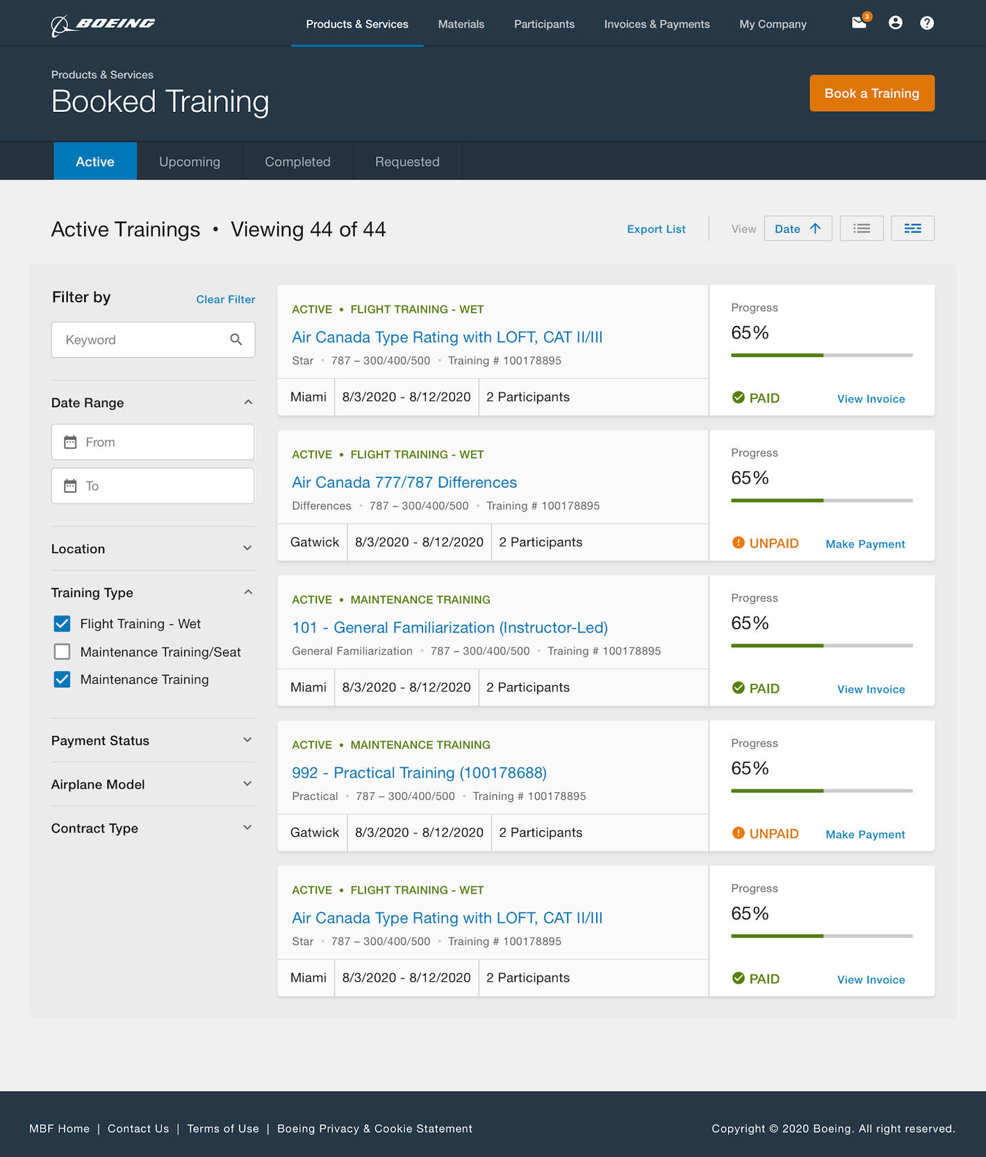
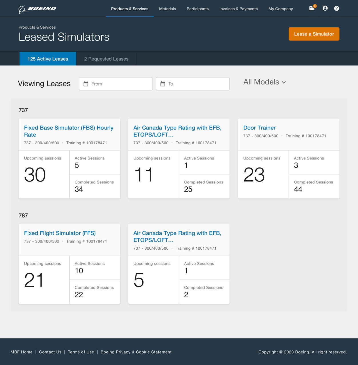
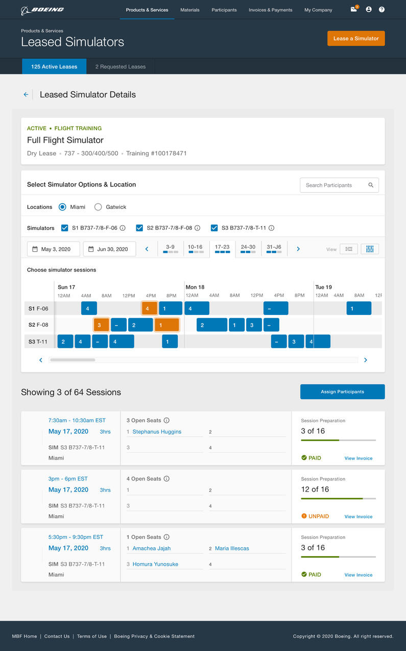
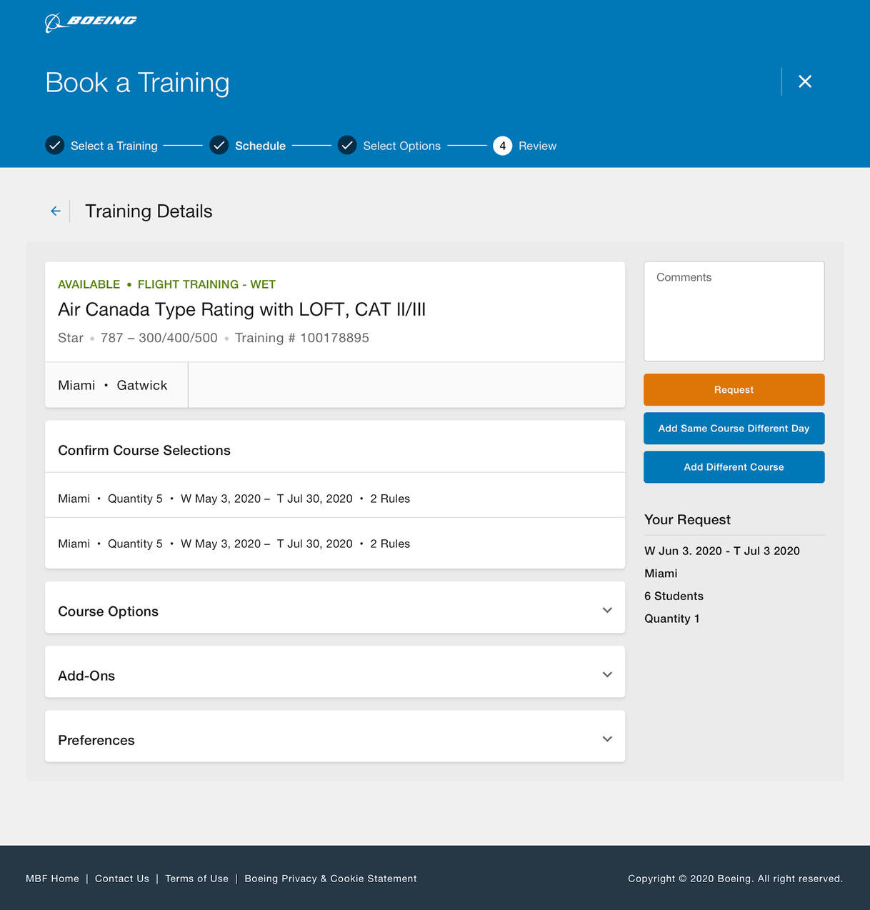
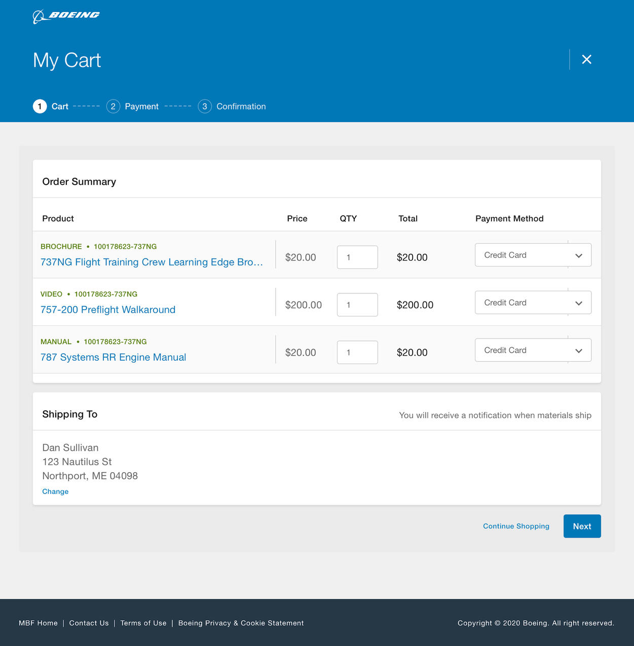
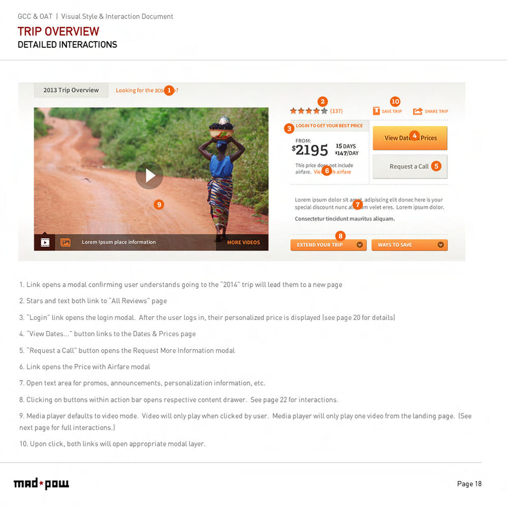
Boeing Flight Training Management Platform
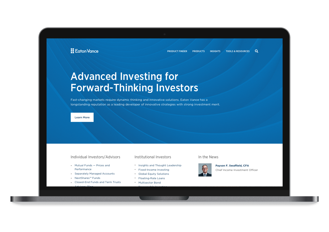
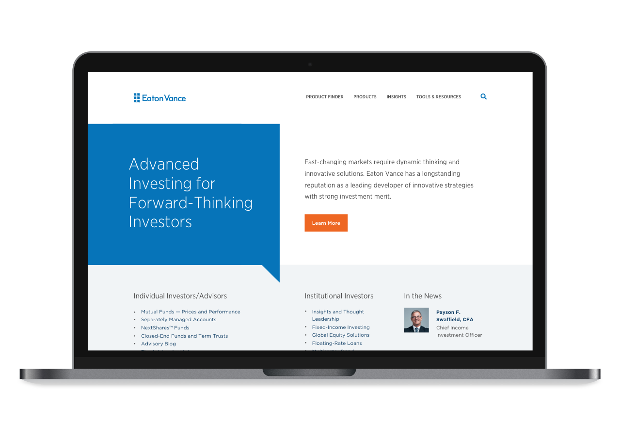
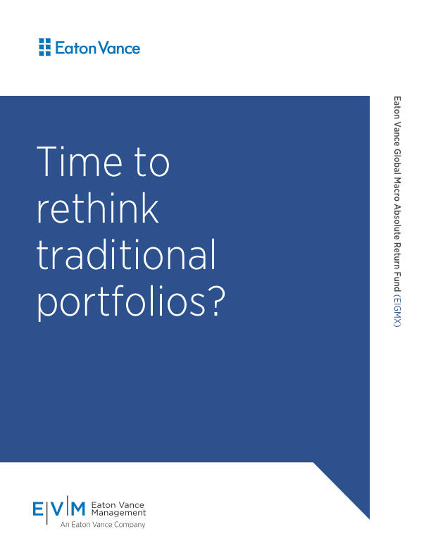
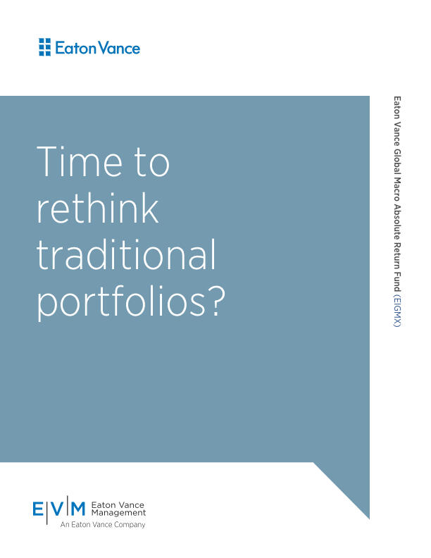
Eaton Vance Integrated Branding
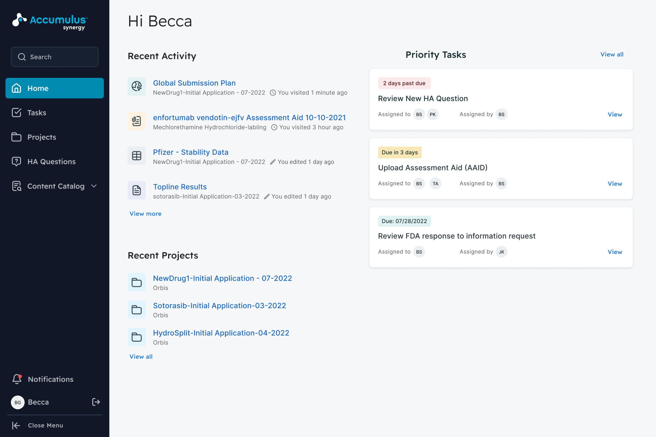
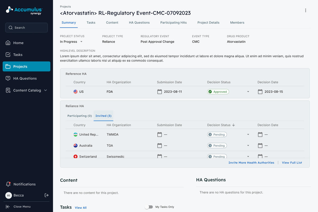
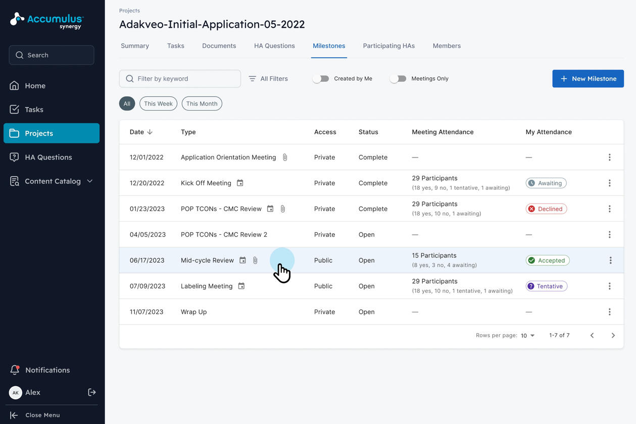
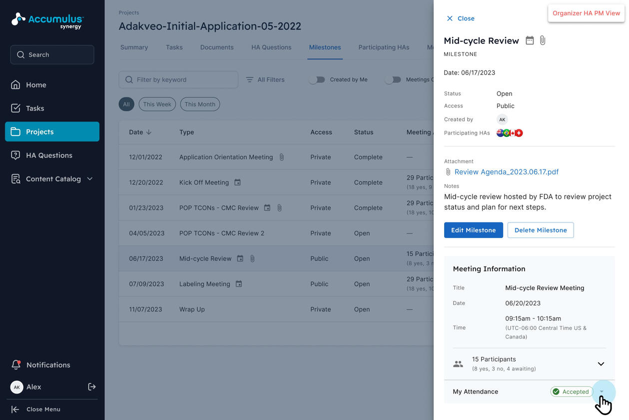
Accumulus Synergy Drug Regulatory Platform
Harvard Pilgrim Health Care Site Redesign
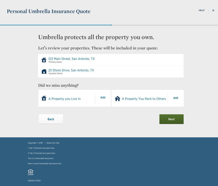
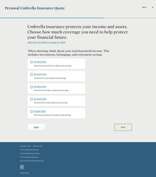
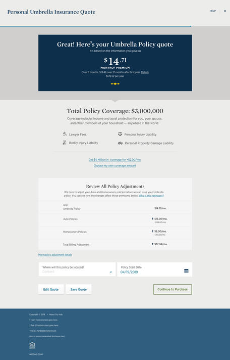
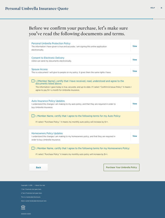
USAA Guided Insurance Purchasing Experience
Grand Circle Travel Site Redesign
Want more? Go further back in time.
BIO
Prior to my role as Head of Design at Proximity Lab, I spent 13 years contributing to the growth of experience design pioneer, Mad*Pow, culminating in its merger with $5 billion global digital design leader, Tech Mahindra.In prior years, I built a full-service web design team at the Timberland Company, managed the digital design group at Bose, and paid my dues doing it all: packaging, environmental graphics, B to B websites, co-running a two-person firm, copywriting, and forward-thinking front end web development.What's kept me passionate about my work for the past 25 years is my unrelenting drive for creative problem solving. Early on, I more often used the elements of visual design to make experiences more beautiful and more usable. These days, I'm still using relentless creativity to solve problems, at a business leadership level.When I'm not in front of a computer, you'll probably find me in the beautiful New England outdoors, where I live with my wife, two daughters, a cat, two dogs, and sometimes, a horde of chickens.
Cigna Site Refresh & Design System
Project Details
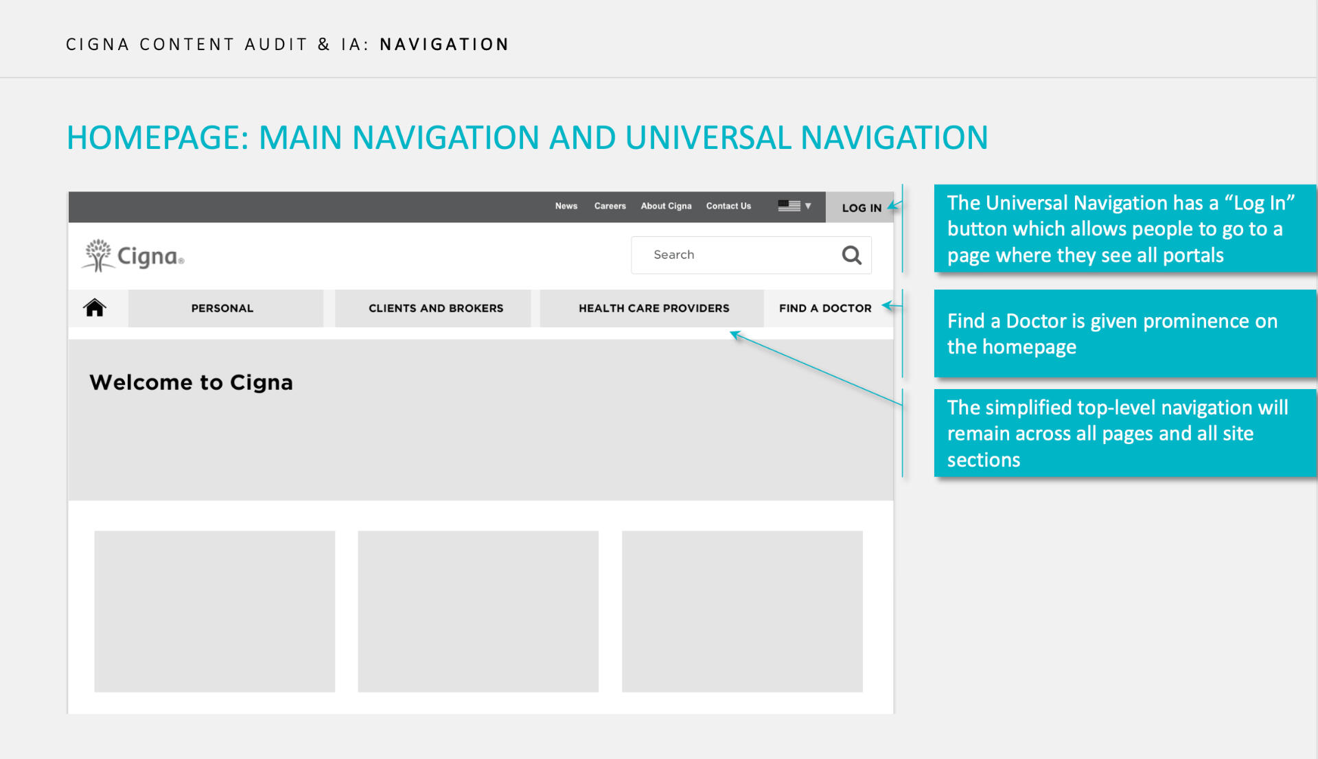
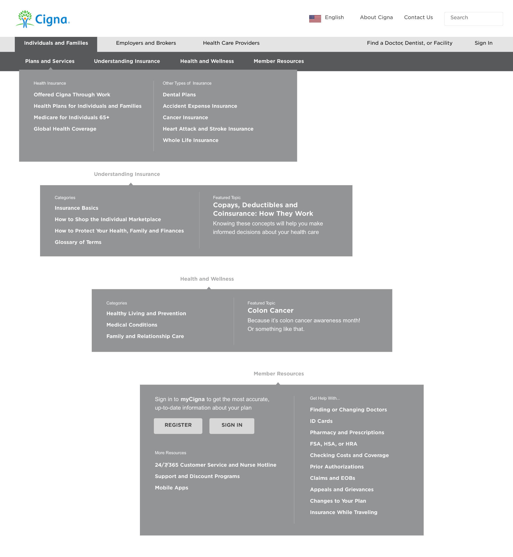
Extensive user research, a 137,000 page content and UI audit, a deep exploration of brand elements and a content and SEO overhaul led to a overhauled global site that improved non-branded keyword search 438% and increased site traffic 81%, while also improving site desirability and task completion.
Experience Strategy
After conducting member interviews, a card sort and a usefulness test on the current Cigna site, the team was able to develop a clear experience strategy that would take the form of four parallel work tracks – content revisions, IA improvements, a visual brand refresh and an analytics strategy – all driven by the following design principles:
Human Centered
Empathize with and understand our customers. Test visual design desirability early and often with real users.Accessible and Inclusive
Digital brand elements/experiences should be easy for everyone to use, read, understand, and navigate.Simple and Consistent
Common design elements across digital properities builds trust by communicating a strong, unified brand.Differentiated
Establishing new and thoughtful design elements will help Cigna stand apart from it’s competitors.
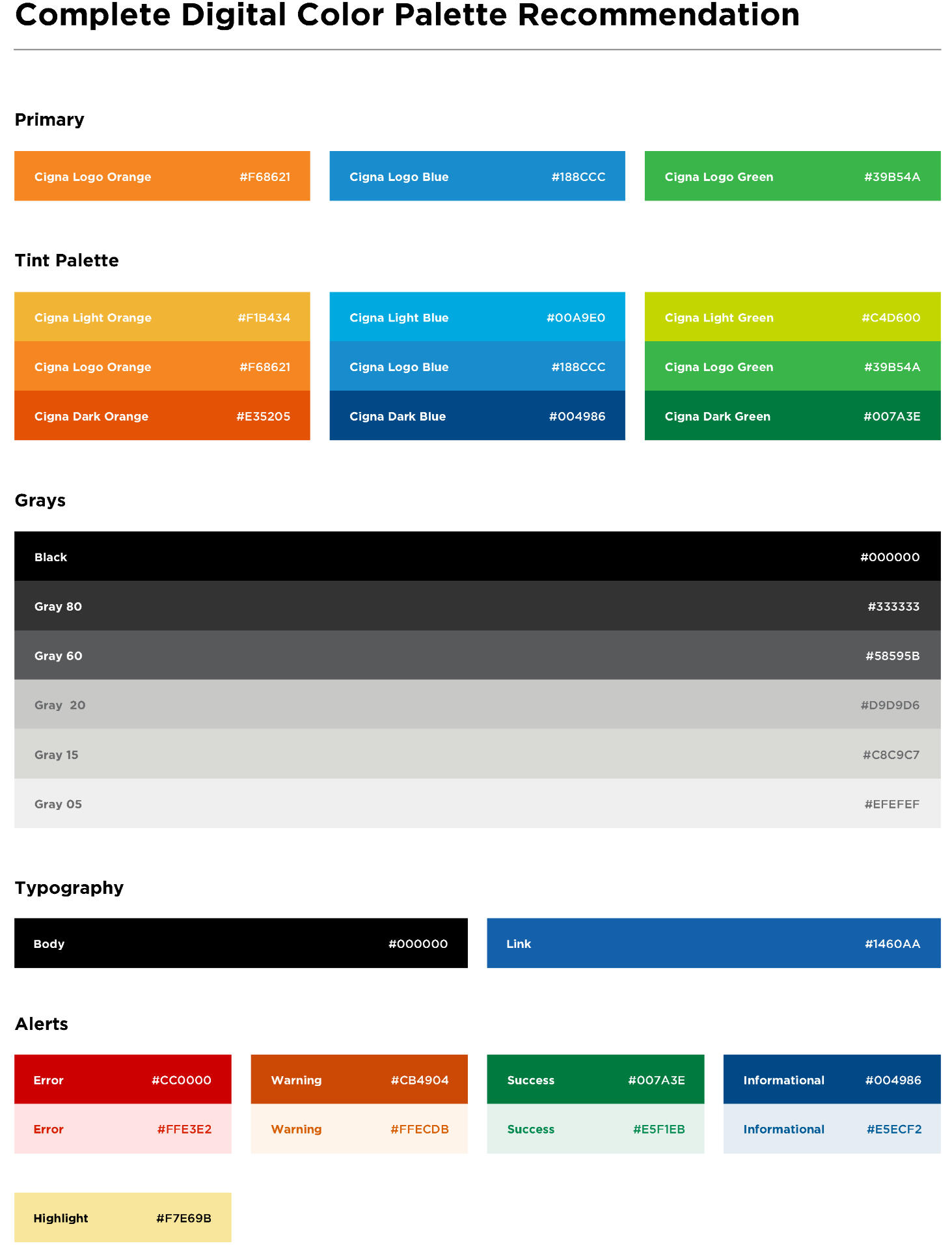
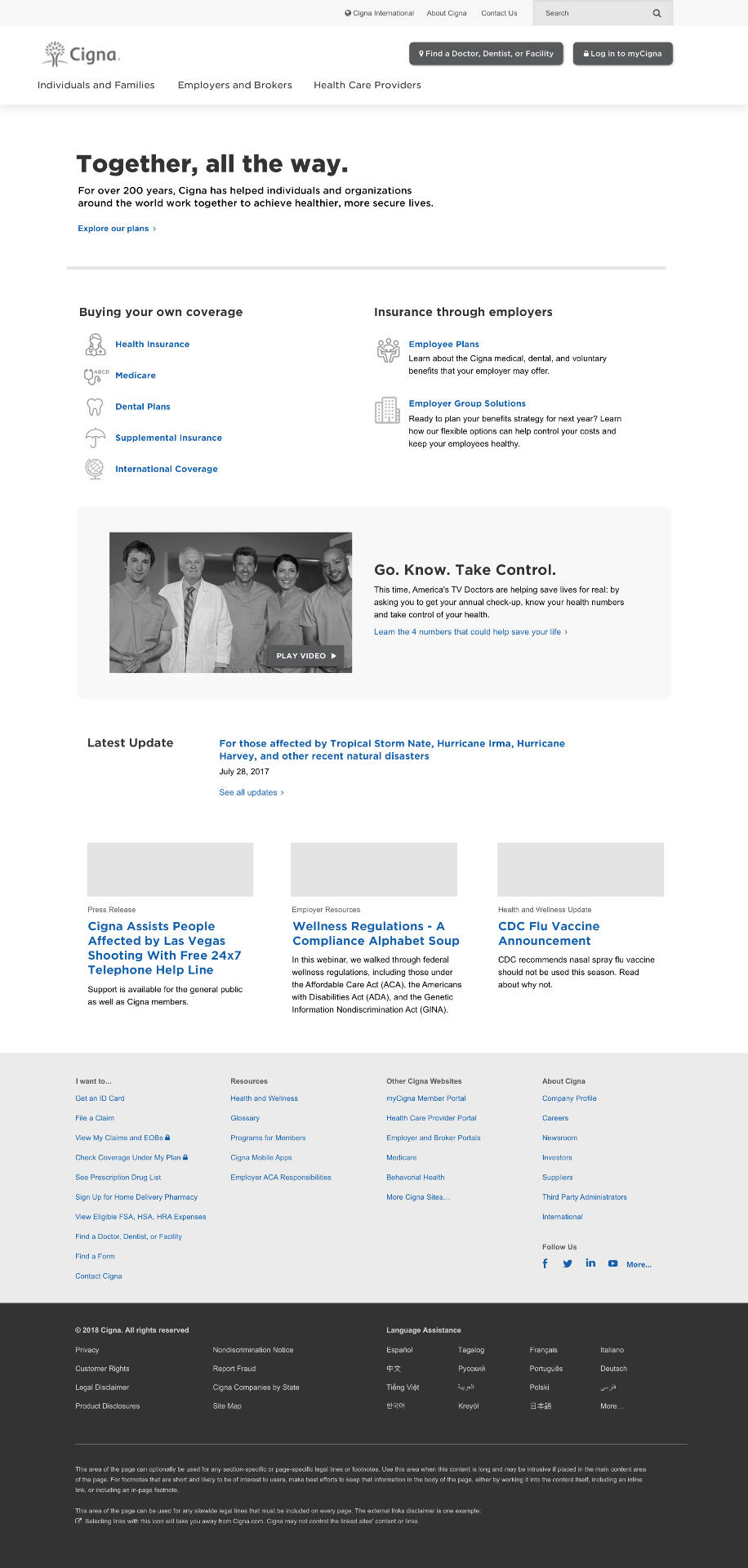
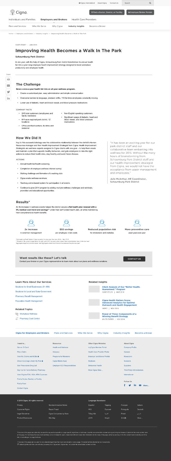
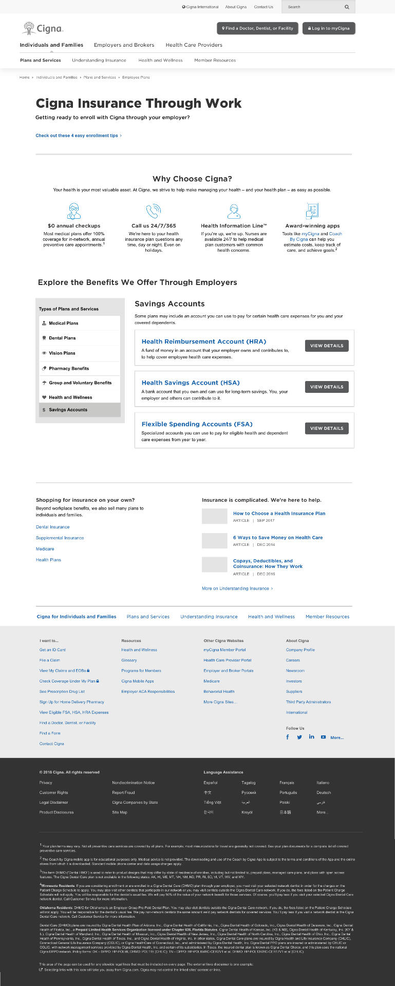
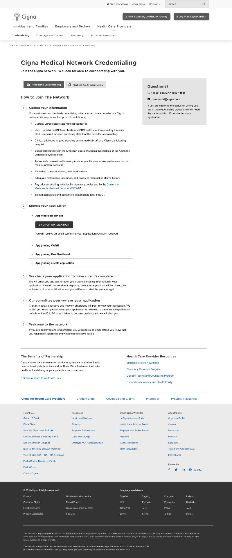
Pushing the Brand Further
As a global brand, Cigna already had strong corporate guidelines, but to complete the project goal of modernizing the visual representation of the brand within the digital space, Mad*Pow facilitated co-creation workshops with the Cigna team to imagine what a new manifestation of the brand online should feel like for a member. That led to the following "experience attributes":
Focused
Calming
Personal
Intuitive
Empathetic
Fresh
These design guidelines would act as the north star for the UI designers to explore as many new manifestations of the digital brand as possible within a cadence of intensive design sprints.Using element collages (h/t, Dan Mall), the team was able to explore a large amount of type, color and layout approaches freely and at a high level before using reviews with the Cigna team at the end of each sprint to hone in on which ideas would move forward.At the end of this highly iterative phase, the team had arrived at a new proposed design direction for the Cigna digital properties.


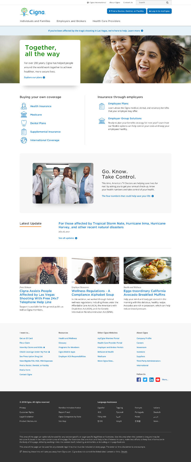
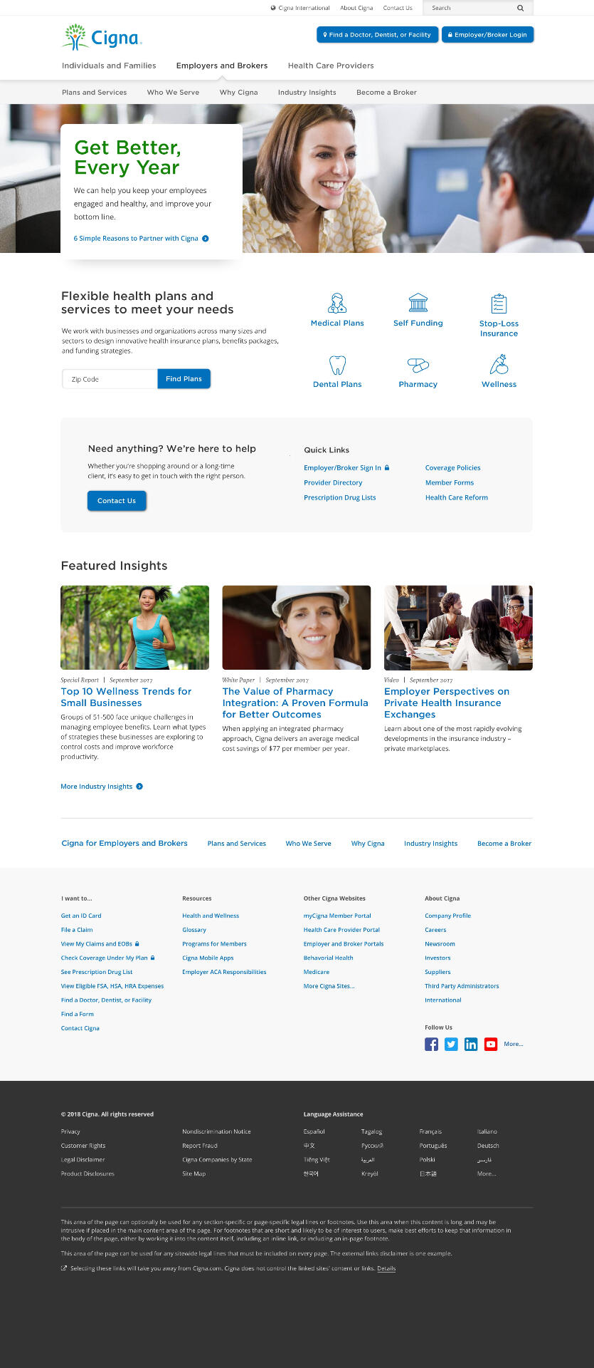
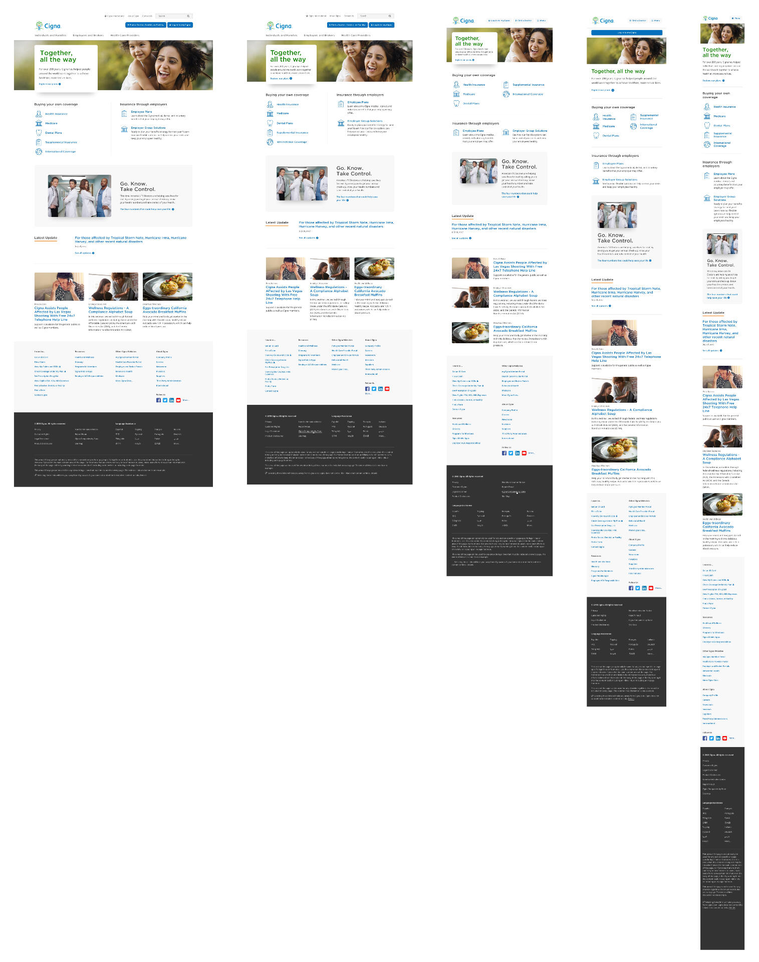
Documenting a Foundation for the Future
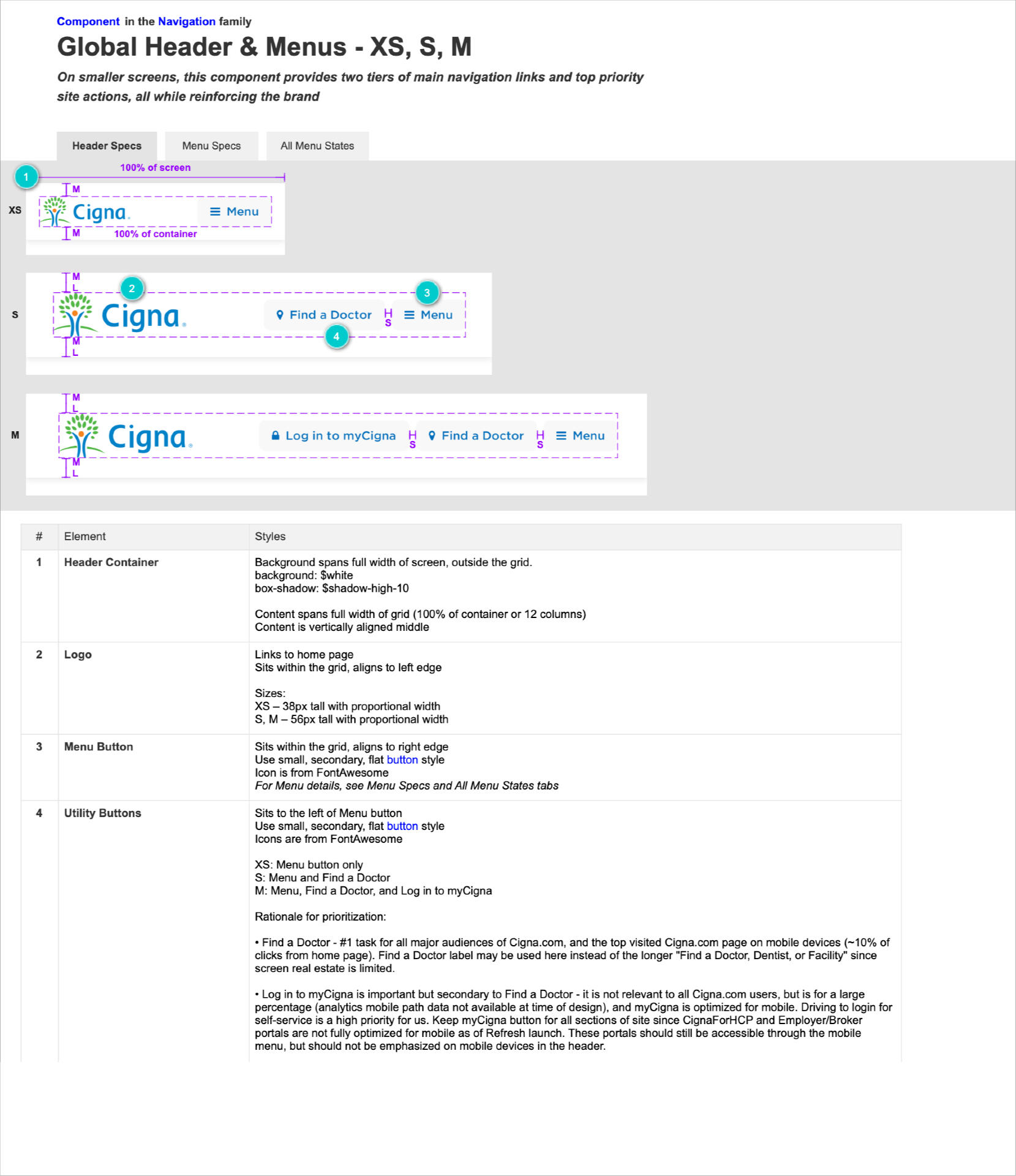
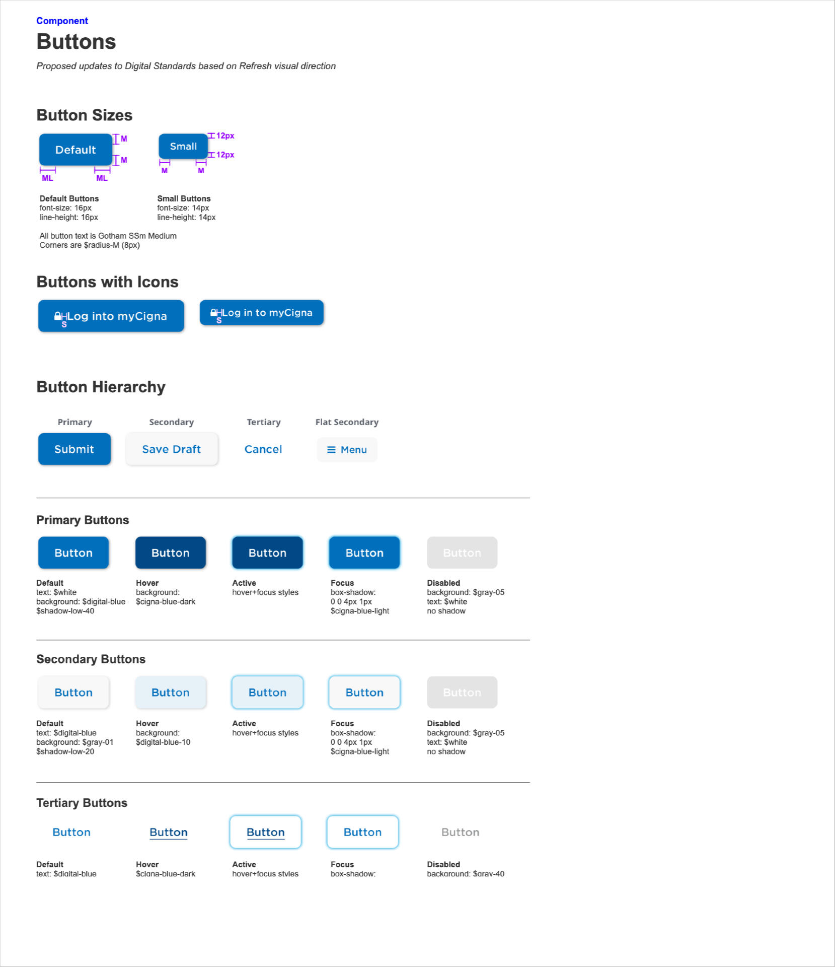
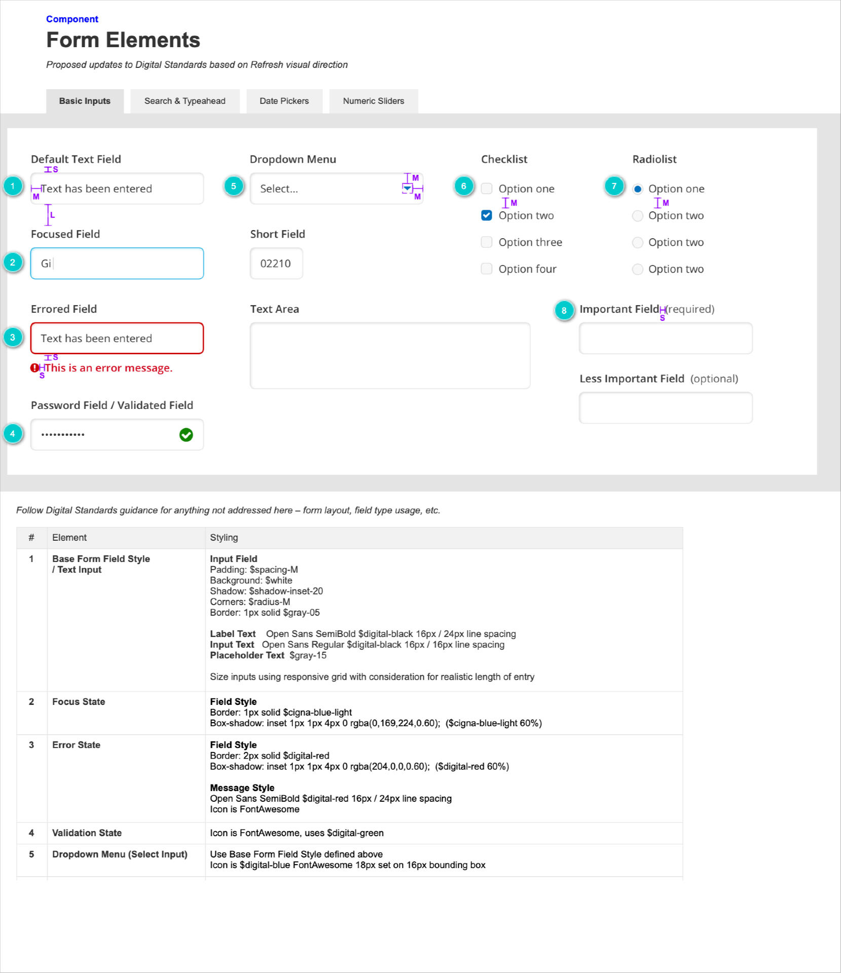
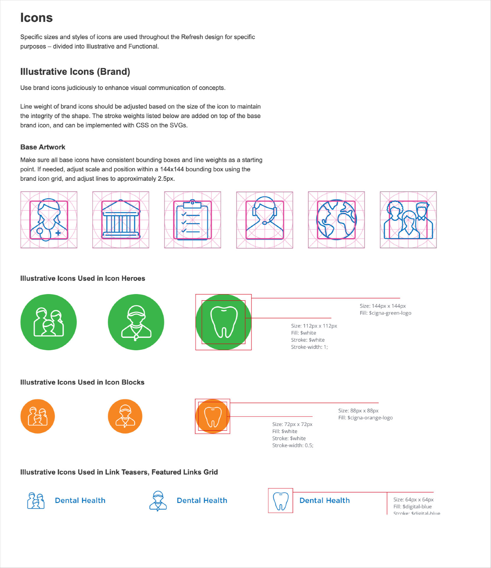
Once the final design was blessed by members and stakeholders alike, it was time to wrap things up by communicating every design decision in the form of a design system.Typically a design system, like the one created for Cigna, documents everything from styles to component usage and code, to the internal organizational governance of the system (how to keep things updated and who is responsible).
Hubspot BI Data Portal
Project Details
An implemented MVP prototype for Hubspot that aggregated an enormous amount of product traffic data into easily digestible and customizable views for monthly synthesis and reporting.
Boeing Flight Training Management Platform
Project Details
Extensive remote workshops led to the creation of a brand new product for Boeing, aimed at allowing pilots and the internal team the ability to book and manage training programs.
Eaton Vance Integrated Branding
Project Details
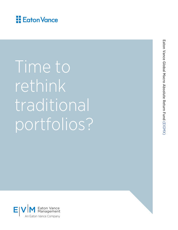
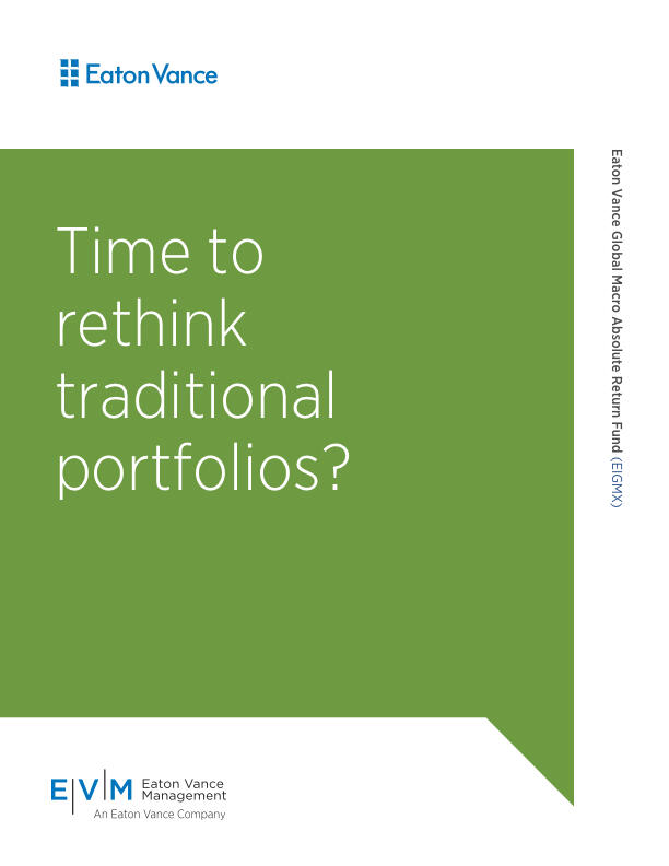
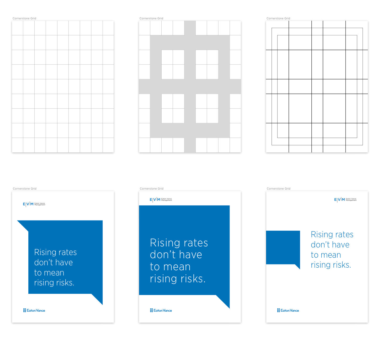
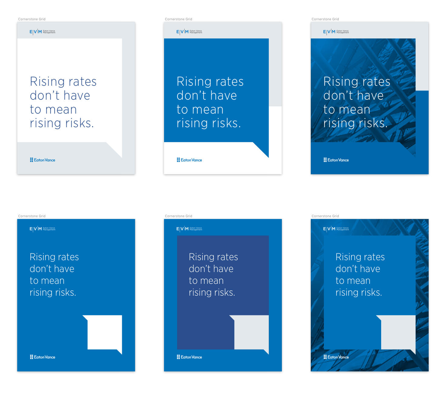
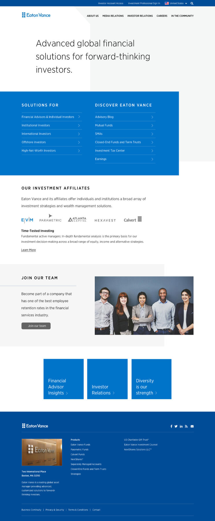
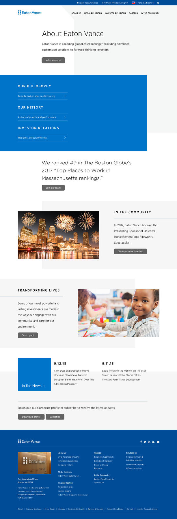
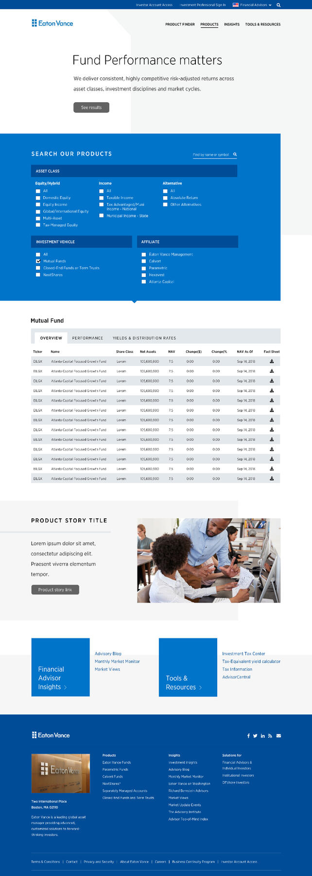
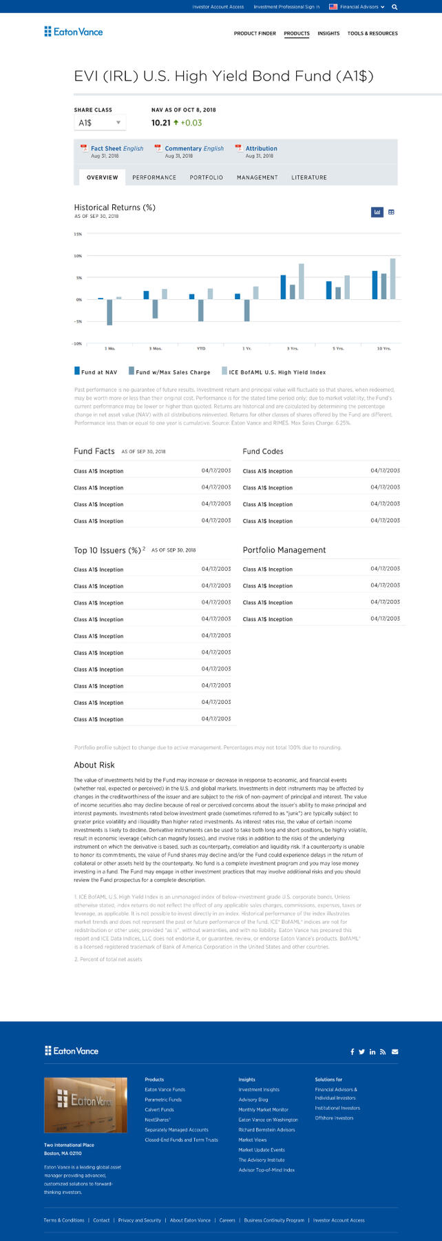
Account work over four years, including development support, UX/UI design, organizational change strategy and refreshed branding concepts across platforms as seen below.
Accumulus Drug Regulatory Platform
Project Details
Product strategy, research, UX and UI design for a transformative startup aiming to disrupt how pharma companies bring drugs to market. Currently live and being used by over 50 of the worlds largest brands.
Harvard Pilgrim Health Care Site Redesign
Project Details
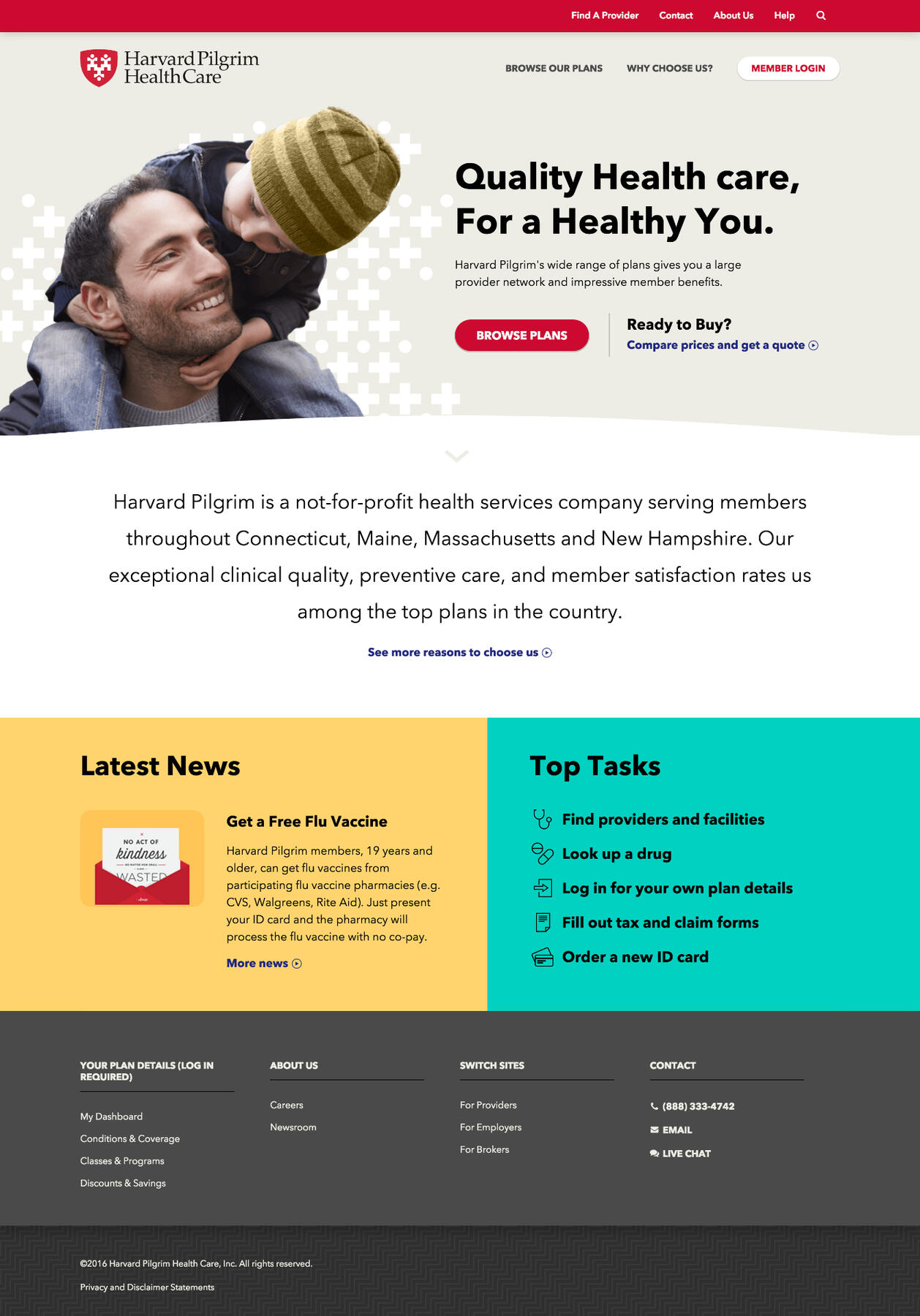
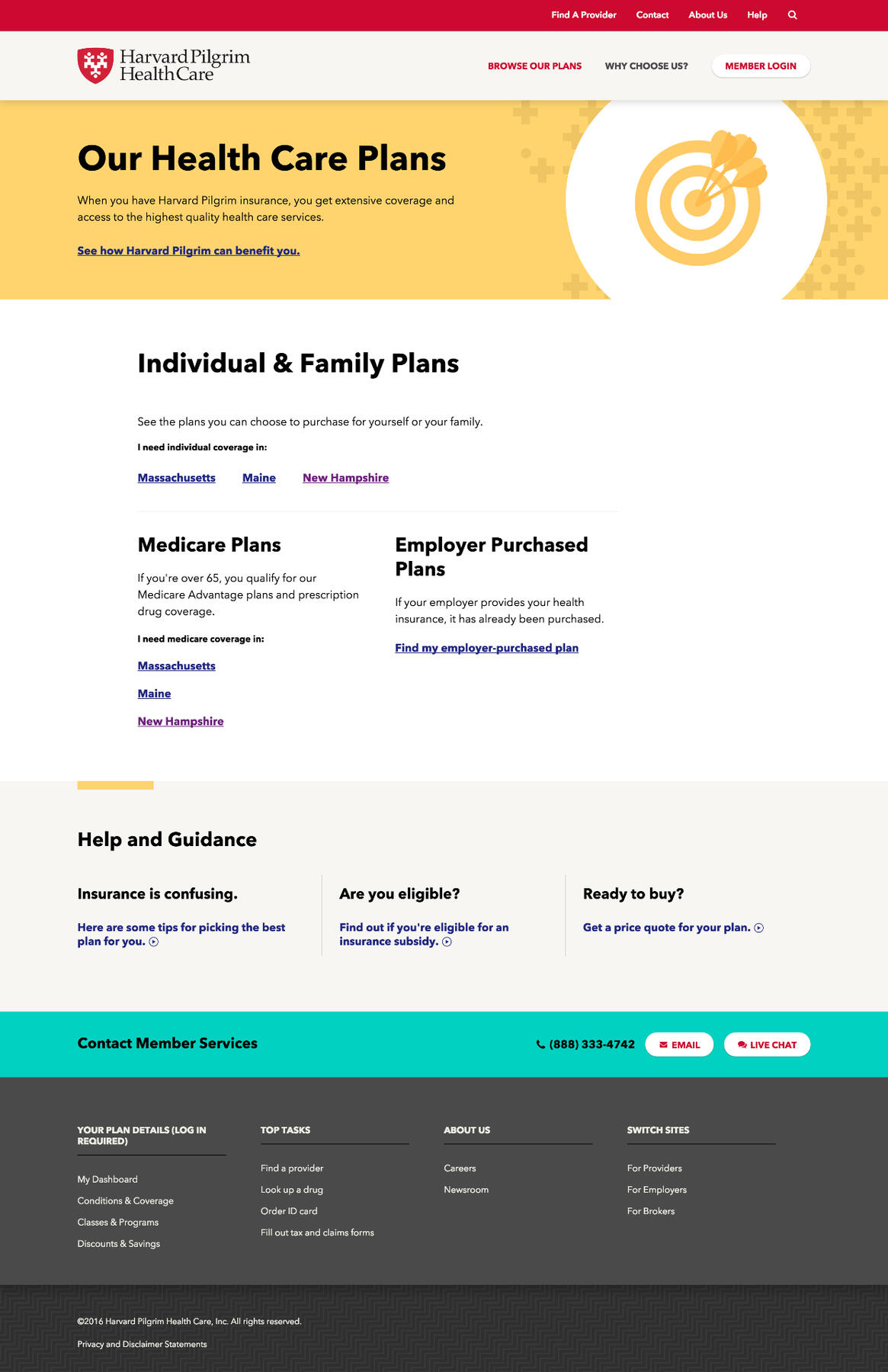
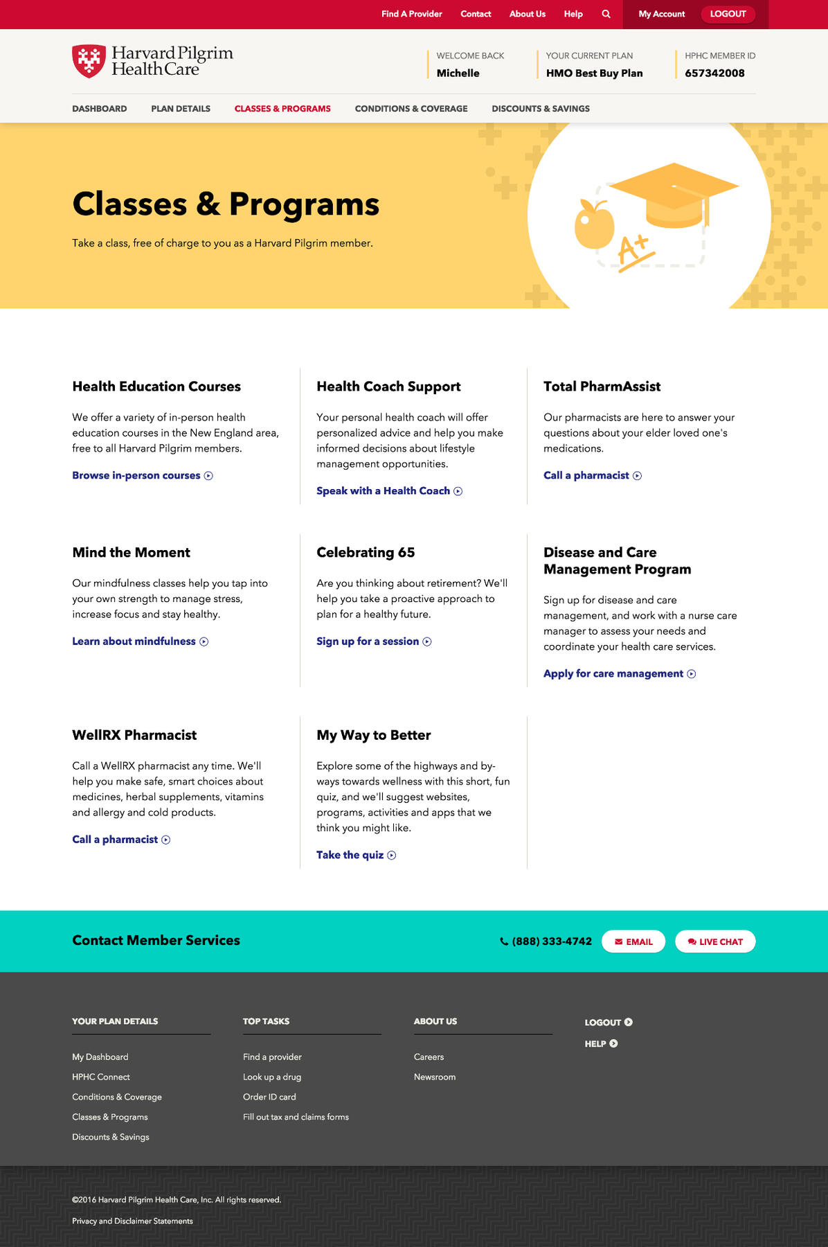
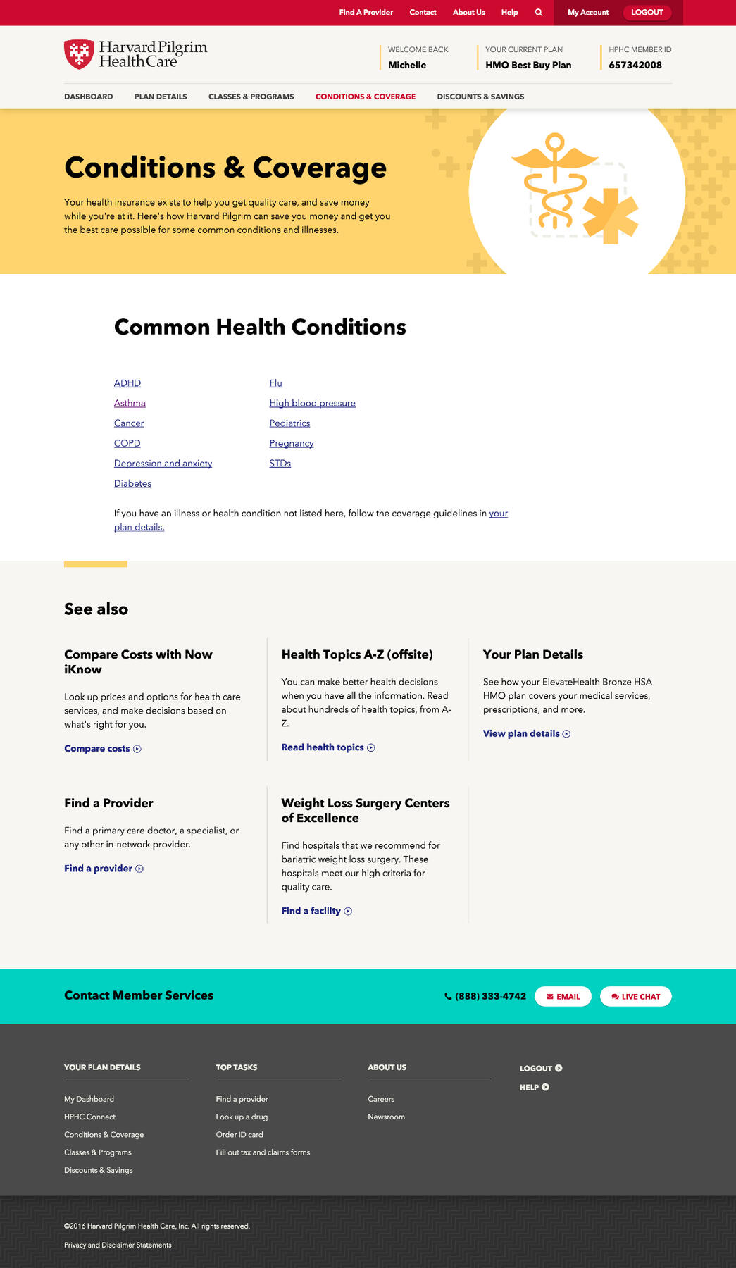
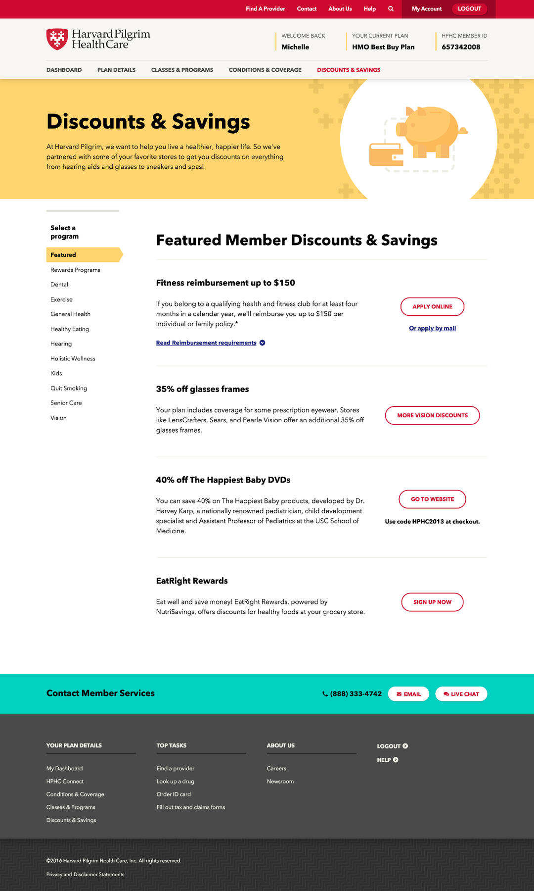
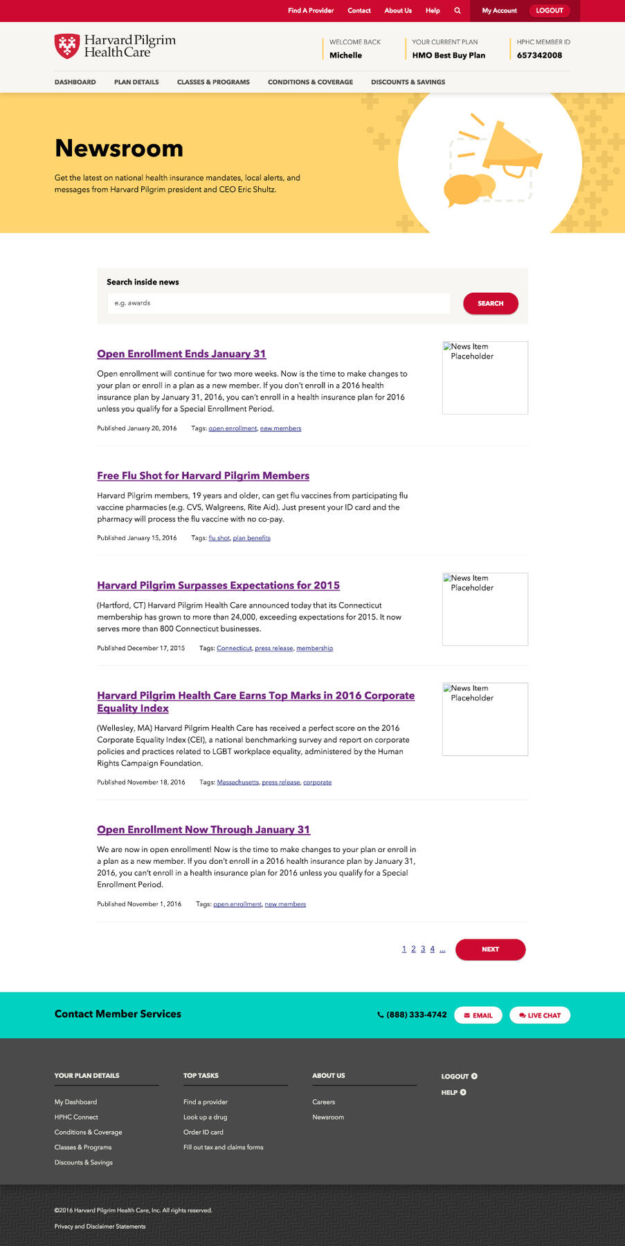
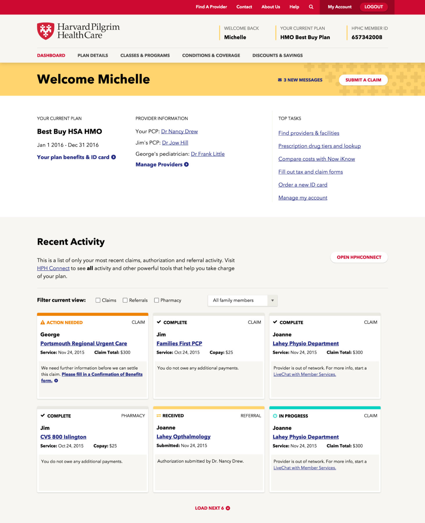
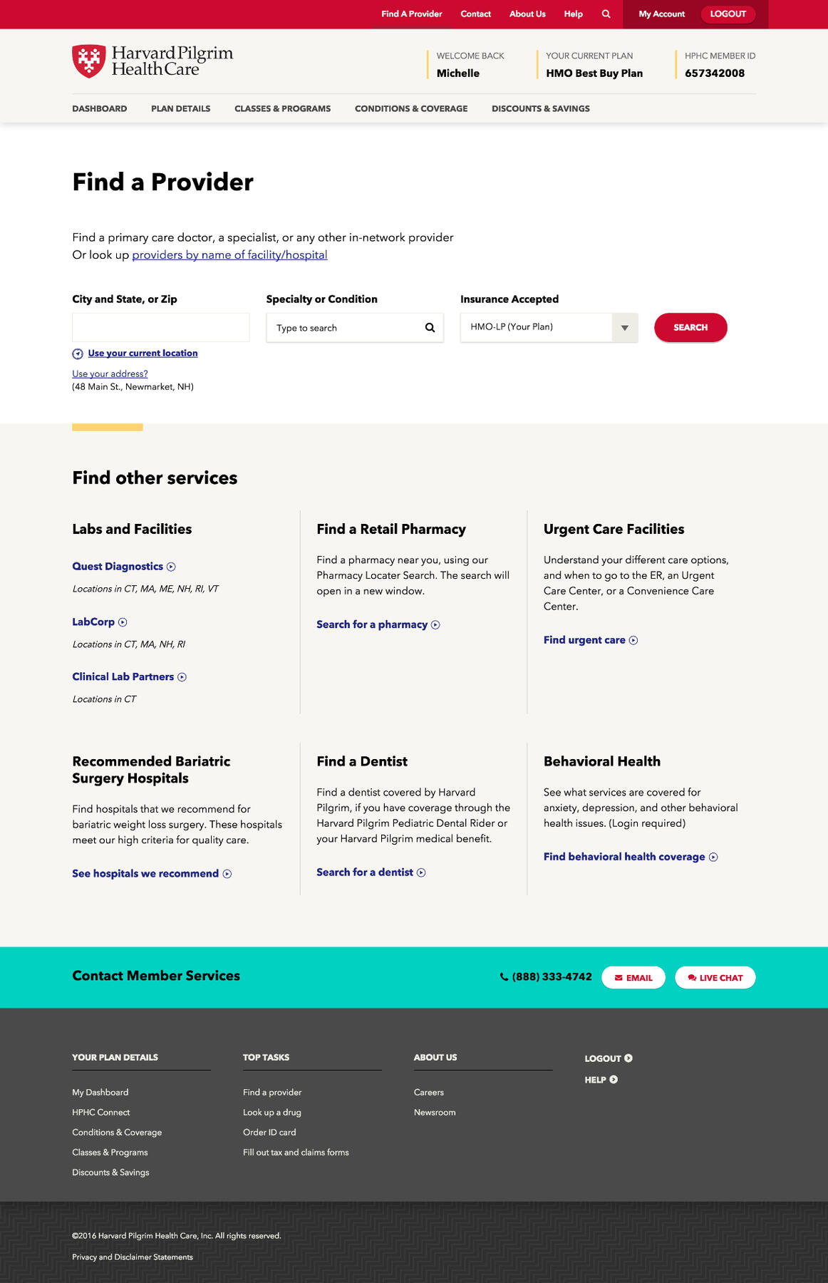
Implemented MVP prototype passed by the Carroll Center for the Blind for accessibility WCAG AA rating, representing a differentiated brand direction (not "blue!") and a completely overhauled content hierarchy for Harvard Pilgrim's global site.
USAA Guided Insurance Purchasing Experience
Project Details
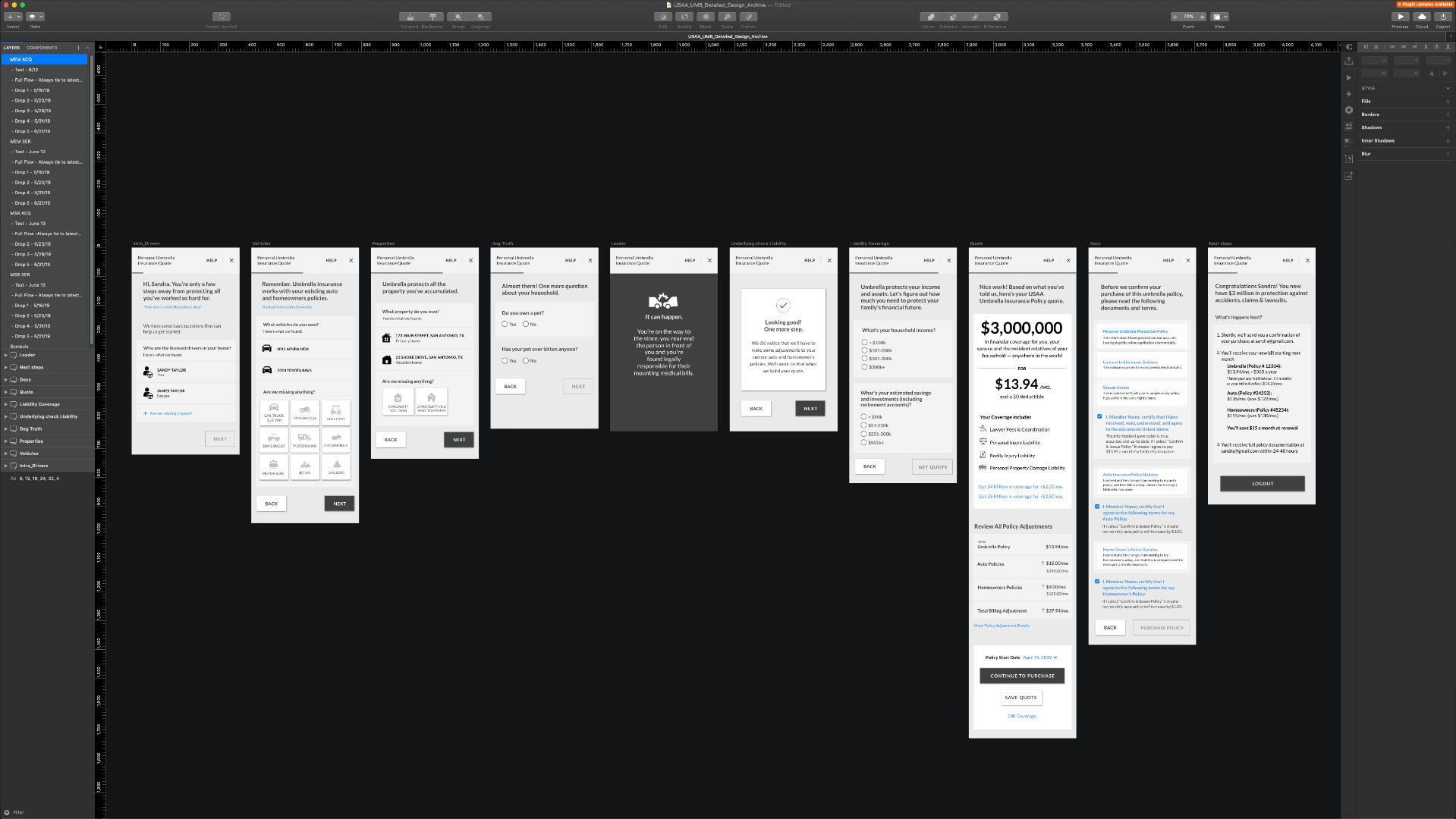
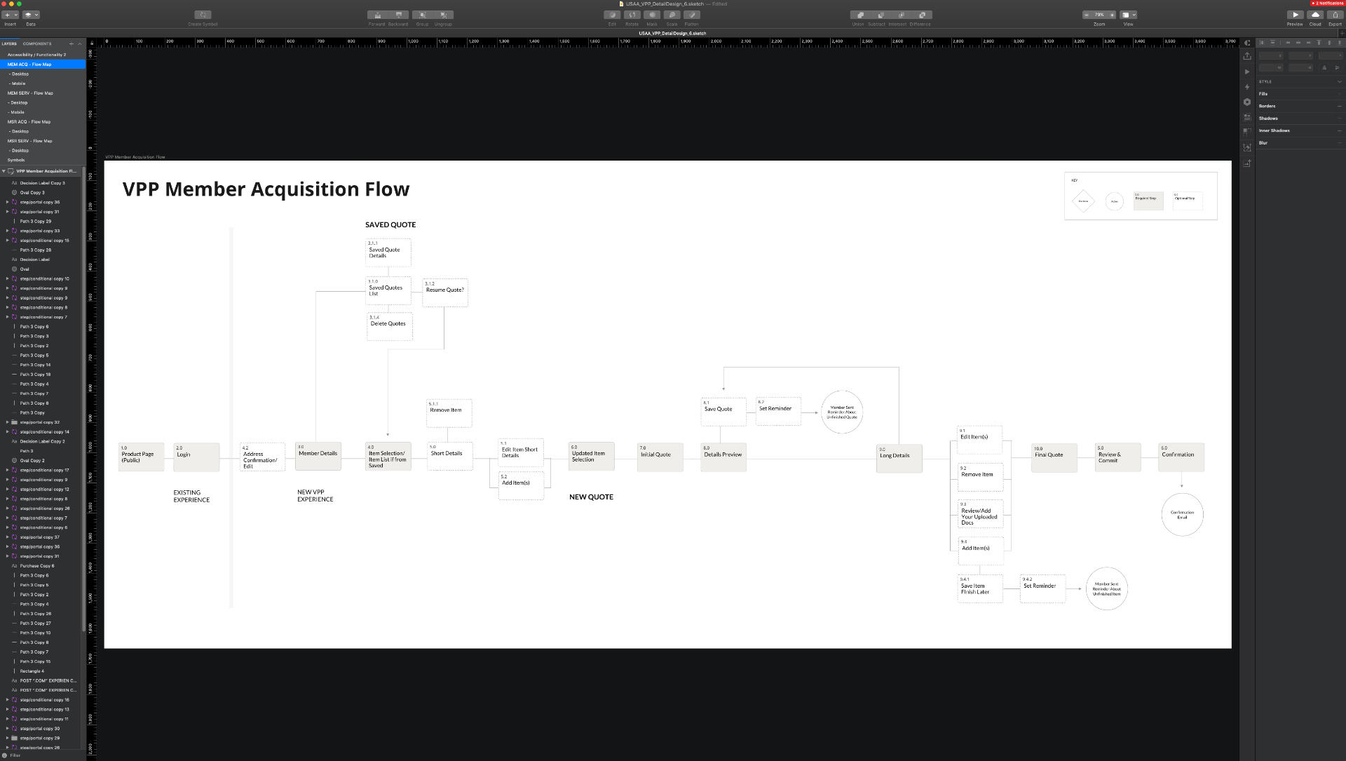
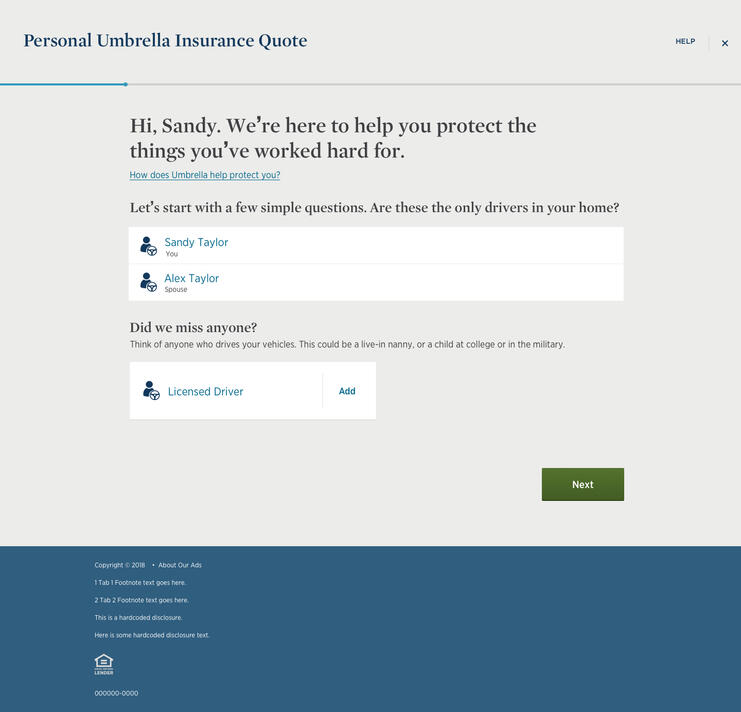
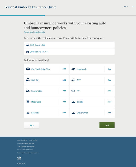
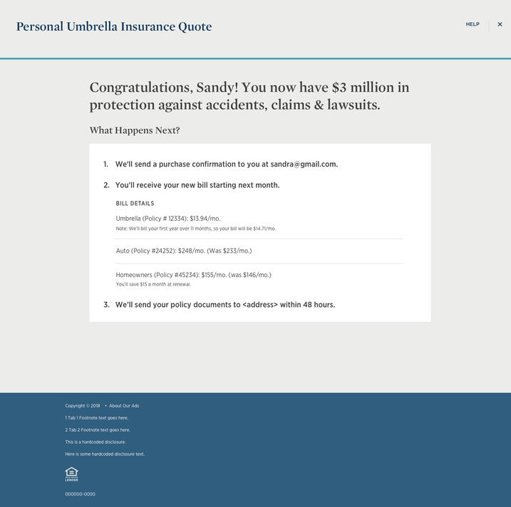
Research and experience strategy to introduce a brand new self-service insurance purchasing flow to USAA customers.
Grand Circle Travel Site Redesign
Project Details
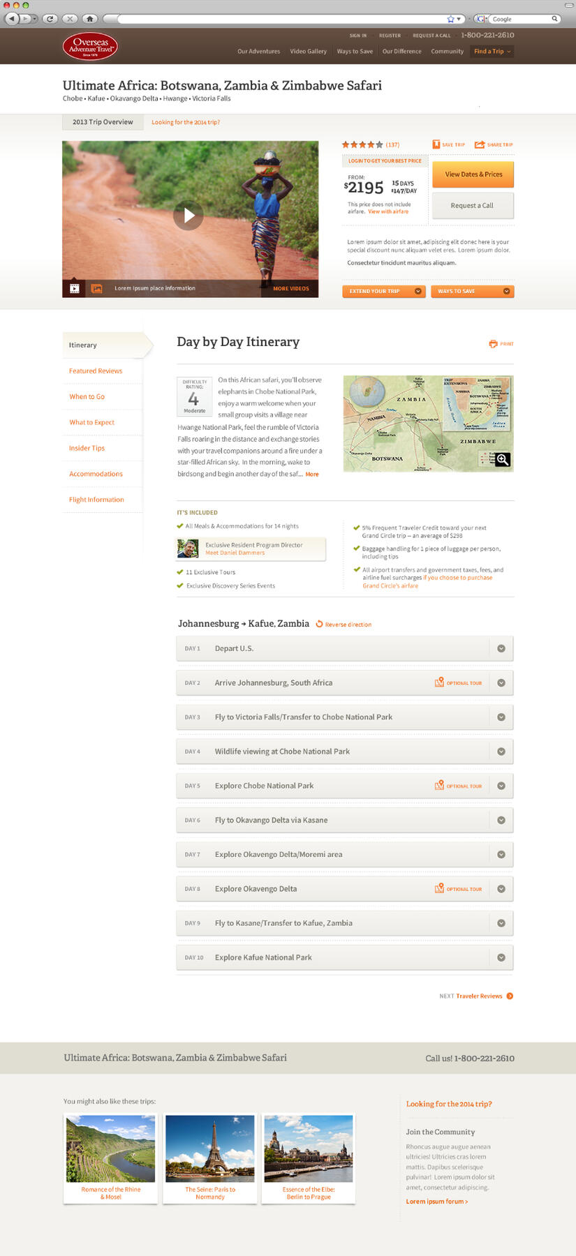
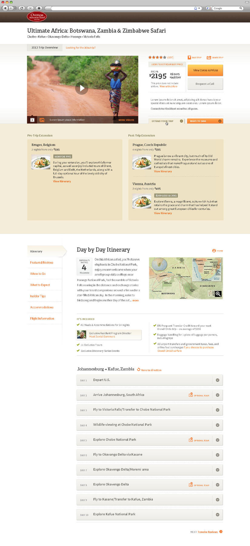
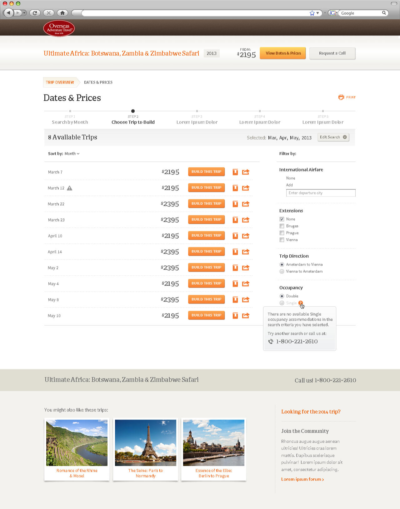
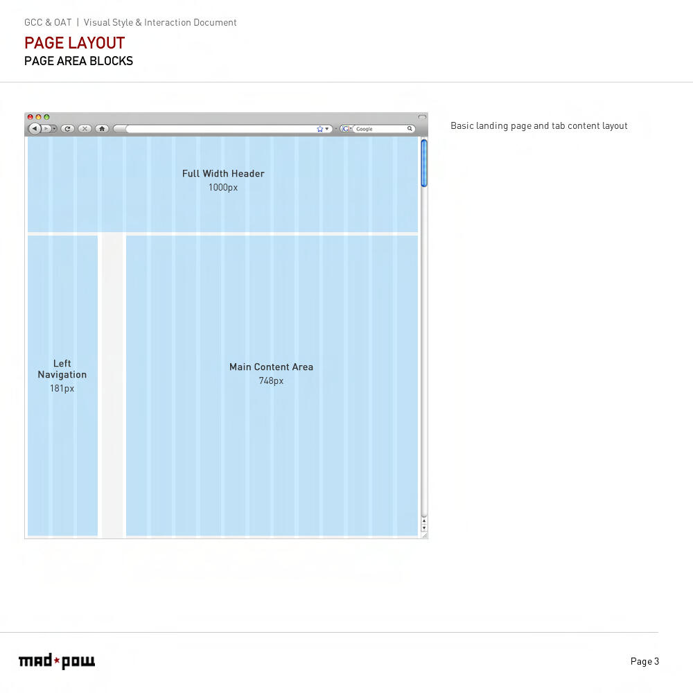
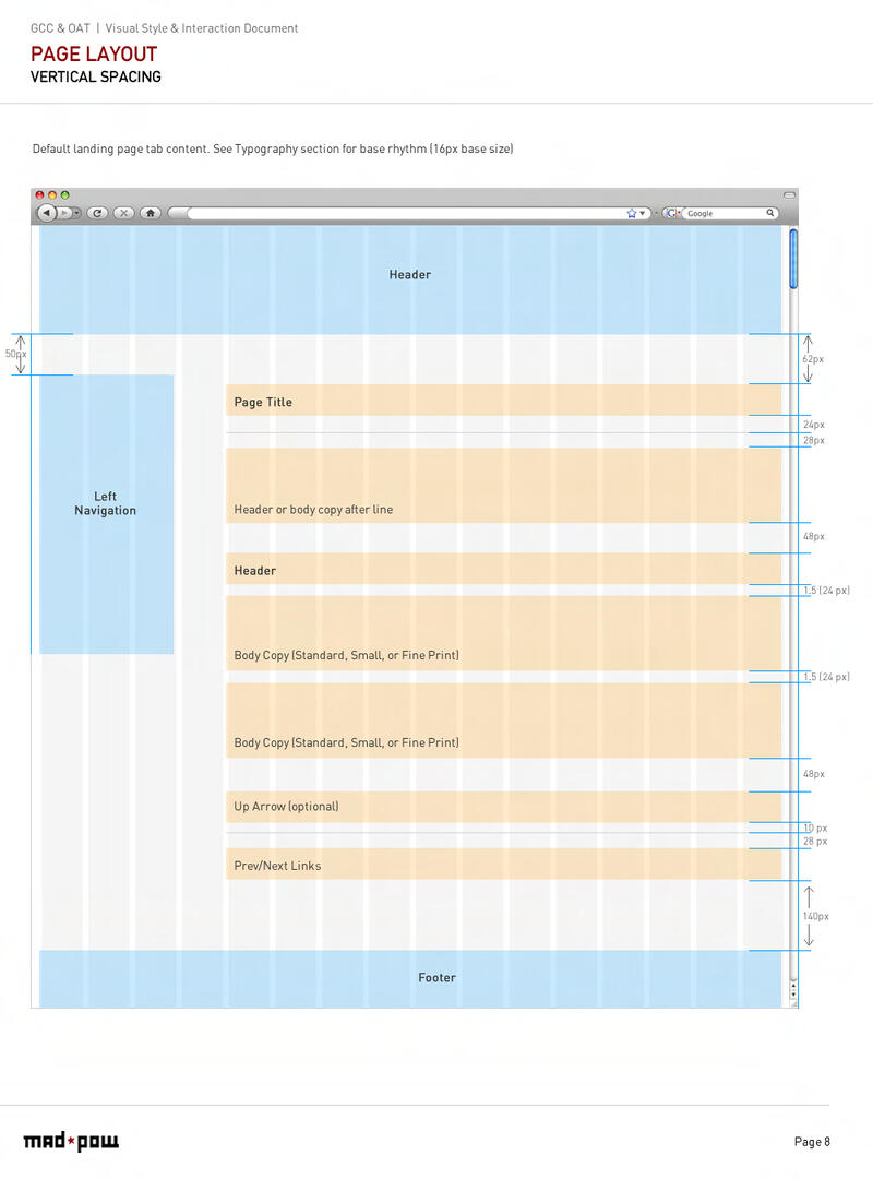
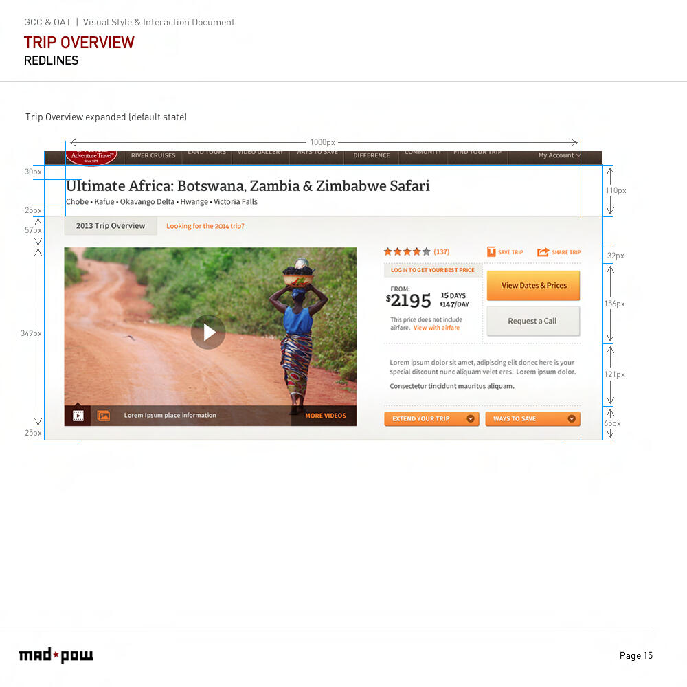
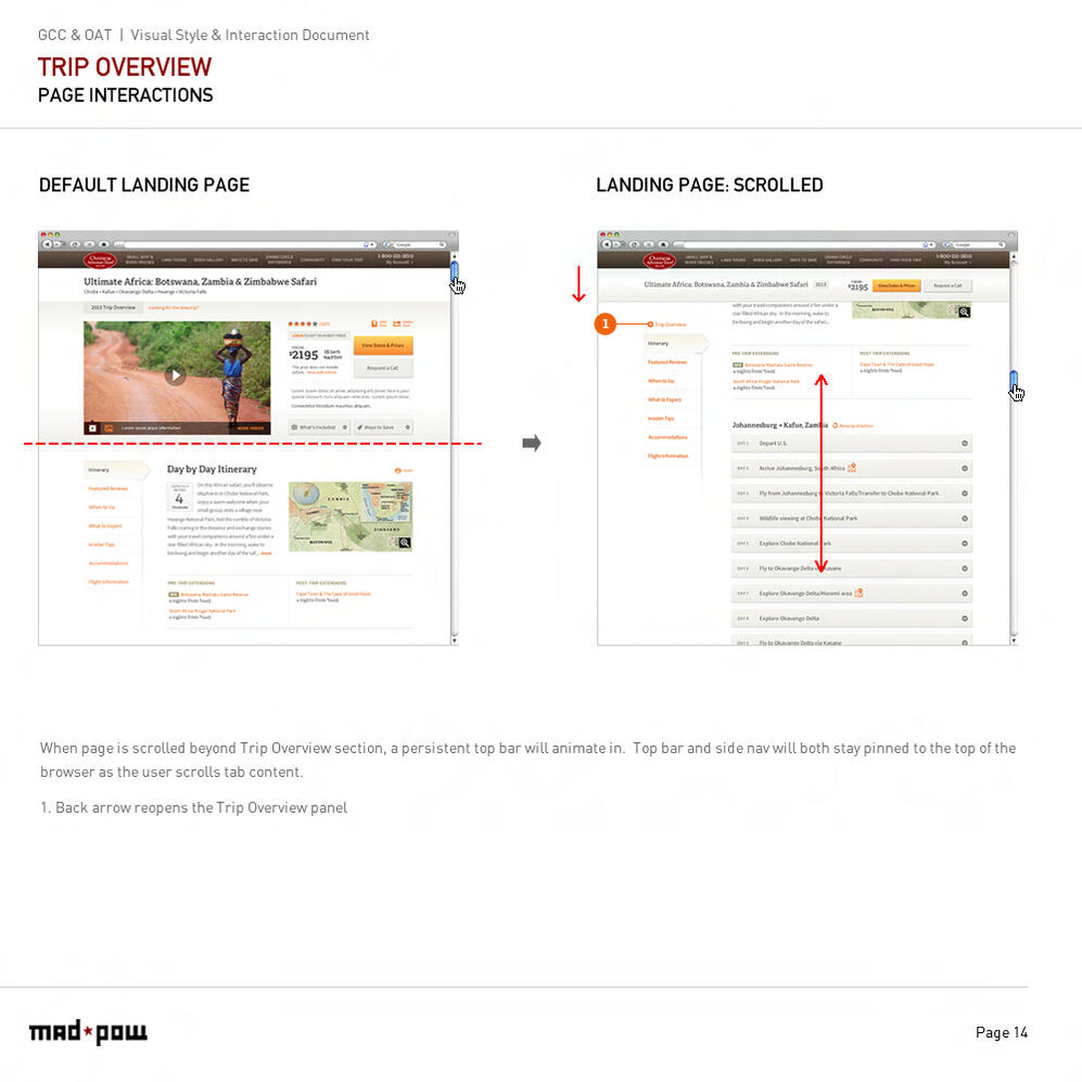
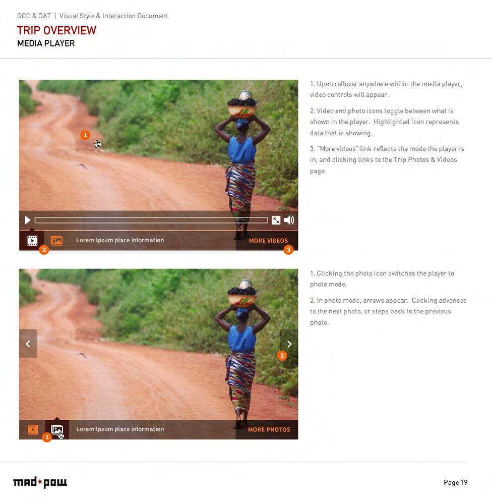
Research, content strategy, and a completely redesigned brand experience aimed at maximizing conversions for a leading guided tour travel company.
